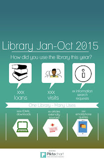
I have twice made infographics. I used Piktochart. I used them for library stats. However, I didn't send them out as the stats are quite low. I don't believe they actually reflect the work of the library. As with most statistics, there's more than meets the eye. I made the 2nd one only in the last week or so. It's fun to make them! I was going to include it in my Library Ireland Week mail
out but have been cautioned against it. This is it - with the numbers removed. The space at the top is deliberate as I was cropping it off. I would like to do an infographic instead of my traditional Word annual report as I think it might be easier to read at a glance.
I had an infographic from Australia displayed in the library for a while. It described how much health librarians really save money. This is it. http://www.alia.org.au/sites/default/files/images/Worth-Every-Cent-and-More-INFOGRAPHIC.png However it didn't print out in a straightforward manner. I had to shrink it down a lot.

No comments:
Post a Comment